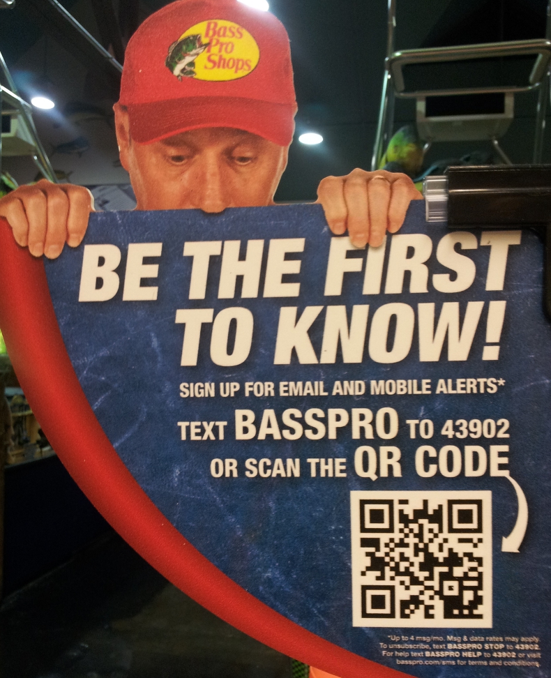
I came across this sign at a Bass Pro Shops store and it immediately captured my attention. It was creative, humorous and perfectly placed at eye level at the entry way of a cashier’s line. Its location ensured good exposure to all customers, those buying and those waiting in line to pay. It couldn’t be missed!
Why should I sign up?
Even though the call-to-action didn’t offer an instantaneous reward for joining, I thought the ad was good enough to help increase their database of mobile and email subscribers. The word “alerts” may communicate “deals, offers or something special” to some customers, so it could work even though a clear incentive for signing up was not expressed. A better idea would have been to offer an immediate 10% off purchase. This kind of incentive is likely to increase signups especially in an area where customers waiting to pay are thinking about the cost of their purchases.
I’m confused
Putting the incentive issue aside, the call to action to join by texting BASSPRO (keyword) to the short code was pretty good. Even though I think scanning a QR is a cumbersome and embarrassing process, I did scan the QR to check out the site.

The sign says one thing but the QR code does another?
I was expecting that by scanning the QR code, it would open my text (SMS) application and show the keyword in the message field and the short code number in the send-to field, ready for opt-in. To my surprise, the QR code took me to a mobile website that asked for my email to subscribe. I was confused. If the sign said to sign up for mobile AND email alerts, how was I supposed to get mobile text alerts if the QR code landing page only asked me for my email?
Keep it simple or you’ll confuse the customer
This is the kind of misused opportunity that happens when you mix your mobile channels. Bass Pro Shops is telling the customer one thing, “sign up for mobile AND email alerts,” but the channels (QR and SMS) are leading in two separate directions. The QR is for email sign up and the text is for the mobile alerts. Unfortunately that was not explained. It was not obvious in the ad and was confusing for the consumer to decipher.
Make your call-to action crystal clear
What Bass Pro Shops should do is first get rid of the QR code and just offer one simple call to action “Text BASSPRO to 43902” to join our mobile AND email lists.
The customer would text the word and get a confirmation of opt-in to the mobile alerts program along with a link to the email signup landing page. If Bass Pro Shops wanted to offer email or mobile signup separately, the ad needed to clarify that. It could say “To receive our text message alerts, text the word BASSPRO to the number 43902” or “To receive our email alerts, scan the QR code or visit this website address.” Adding the website address under the QR code is always a good idea. It gives the customer a preview of what to expect from the scan and if the customer doesn’t have a QR scanner app or doesn’t know how to scan, he can always type in the web address on their smartphone.
Lesson: Test all of your ads in real life
It’s important for marketers to always test their call-to-action display ads in their real environment. This helps them understand what the interaction is like between the ad and the consumer in the real world. Have you come across any examples good ads that don’t work in real life? The billboard phone number that is too small to read? Tell us in a comment below.